")


“Aladdin and the Magic Lamp” is a fairytale that never gets old. It’s a great story. Even in its many versions, all of the Aladdin stories have some things in common: the lamp, three wishes, and (who could forget?) a genie. What is it about the story that readers and movie-goers like?
As one of our family’s favorites, Disney’s versions of “Aladdin” created a genie that was full of personality as well as “phenomenal cosmic powers.” Something that makes Genie so likable is his shapeshifting abilities that allow him to both crack jokes and adapt to his surroundings.
These days, just like the resilient Genie portrayed in “Aladdin,” your school website must have a responsive design that is adaptable based on the needs of your site visitors, whether on their desktop, smartphone, laptop, or tablet. Your school’s website must supply the information they seek in a seamless, convenient way.
If your school doesn’t have a responsive website design yet, I’ve got bad news for you—your website is old and outdated!
When it comes to technology, there is no place for old and outdated. For example, Microsoft is in the “End of Life” stage with Windows 7. In January 2020, the company will end support for any systems still running the outdated operating system. Apple does the same, dropping support for many older devices. Like it or not, when it comes to technology, it’s adapt or die. Let’s compare this to your school website. If your website hasn’t been updated in the last five years, chances are it may suffer from one or all of these issues: a lack of security, out of compliance with ADA requirements, or unresponsive.
In this blog, we’ll focus on what responsive design does for your school website. As you provide full access to your website for all devices you expand, deepen, and fortify your connection with your school community.
Let’s look at some of the reasons responsive websites offer “a whole new world”—because by providing full access to your website on all devices, you are doing just that!

“Phenomenal Cosmic Power, Itty-Bitty Living Space”
For Aladdin’s genie, he was limited by his living space, but online there are no spacial limits. In our fast-paced and quick-to-change world, it can be tricky to keep up, technologically-speaking. A responsive website design (RWD) is a product that makes an easy-to-view and navigable experience for your site visitors, regardless of the device they are using. The website design responds to the orientation and size of the visitor’s screen, so no matter what device your visitors are using, the design will help your school put its best foot forward and create a smooth, accessible experience.
School Webmaster’s Director of User Interface, Sarah King, explains, “Responsive design is thinking about the needs of the end user based on what type of device they are using, the size of that device, and what information is most important to see first based on screen size. For example, how do we maximize the use of the smaller real estate of a phone screen but still get all of the same information in an intuitive manner on each page?” Sarah continues, “One example would be the main navigation. The font would be super tiny and not very legible if we left it all in a horizontal row. We could put it into just a plain link list at the top of each page, but then it takes more scrolling to get to other information below it. Thus, the industry standard is to use a collapsible hamburger menu where this link list can be collapsed and hidden when its not being used.”
Layouts of a school’s responsive website may change from device to device, depending on the screen size and resolution. Websites lose the high bandwidth and slow-to-load elements, such as large photos, when a mobile-friendly school website is viewed from a smartphone where the navigation is simplified.
Mobile-friendly websites require very little resizing, panning, or scrolling to get to the information visitors need. If a visitor is on a tablet or a desktop, your school website would automatically resize for those device sizes.
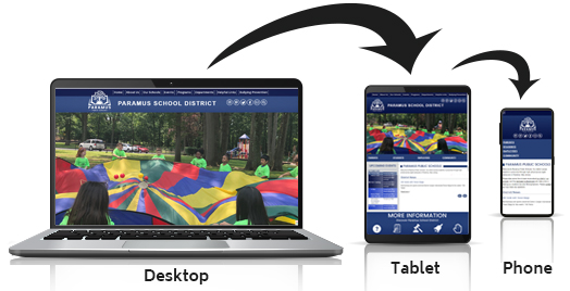
Here’s an example of how one school’s website changes depending on the device.
Poof! What Do You Need?
These days, schools must be in the marketing business. One important tip to remember is that it’s not always about what you want others to know about your school. It’s about what they want to know. Schools that excel at public relations and customer service consider their prospective school community as well as their current parents and students. Your website’s content is for them.
Considering a topic? Think of them. Wondering how to word something or which tone to set with a certain communique? Think of them. If you’re not sure what they need most from your school’s website, talk to them and find out. Online surveys are a great way to reach a large group and gather in the information.
Sit Down and Get Your Wishes
If you’ve been procrastinating a redesign because you’re not convinced it matters to your audience, please reconsider. Even if your school or district is located in a rural community with limited internet access, parents and students across the board demographically have internet access and devices, especially on smartphones.
When developing a responsive website, be careful not to get too fancy. Tried and true website architecture works. It works because people know where to go to get what they are looking for. Use horizontal and drop-down navigation if needed. Quick links help target certain audiences such as students, parents, staff, and community. Categories should not be your primary navigational structure however, because not all your visitors will fit those molds.
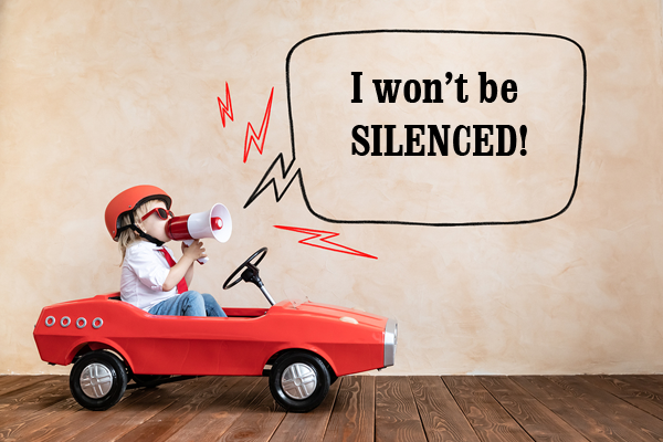
You Need Not Be Silent
In 2019, Naomi Scott moved audiences with the new song, “I Won’t Be Silent” in Disney’s live-action version of Aladdin. Your school website will stand up and speak out when it allows visually impaired users to view it without having to use zooming because of it’s responsive design that allows it to reflow when it’s resized.
A responsive design assists with accessibility standards. If you need to become accessible, consider creating a responsive design at the same time. Responsiveness and accessibility serve the same functions; the two are very complementary. It is ideal to develop both at the same time. The strategy involved in making a site that adjusts to various devices requires coding a site to standards that also move you toward website accessibility. Going responsive is a step in the right direction toward school website accessibility.
Website ADA compliance is a requirement and at the heart of website accessibility. Fortunately, a responsive design, together with an ADA-compliant website helps ensure compatibility with the different devices your current and prospective students and their families use. It also helps to ensure the proper functioning of screen readers and other accessibility devices.

A Diamond in the Rough
To create a responsive website design, developers usually use a grid layout, which allows the resizing and rearranging specific elements to adjust to screen size. This is why responsive sites generally have a similar stacking pattern, particularly when seen from tablet and phone views. This is beneficial for your school because becoming familiar with the design and navigation of your website will be relatively easy.
While unique school website design ideas are sometimes lost with this familiarity, it’s important to remember that when your site visitors access the website remotely, they aren’t there to exercise their tech-savvy web skills. They’re there to find information fast. They’re looking for bell schedules, lunch menus, calendars, teachers’ email addresses, and other important information. Don’t worry if your mobile design doesn’t create exciting, new experiences for your visitors. Such simplicity for mobile devices is evidence of the value your school places on considering the community’s needs.
Having a responsive website design helps you avoid certain navigation problems. Static sites viewed from a mobile device often have usability issues like non-clickable links, tiny text, and navigation too small to read, images that take up the whole screen, and various scrolling problems. A responsive website design allows your school to present itself crisply and cleanly. In other words, your site can shine in any situation.
Own the Place
Your school website’s responsiveness emits confidence to your school’s community. It also means your approach and care increases your chances of being ready to support tomorrow’s technology. Stay current and confident.
Since responsive website designs are fluid and flexible, they are more likely to adapt to whatever becomes technologically available in a few years, regardless of size. We all know how quickly technology changes. Avoid being caught with an out-of-date school web design that will no longer meet your audience needs.
Also, more and more people access the internet from their smartphones. If you’ve checked your Google Analytics in the last few years to see your audience and the types of devices they use to access your school’s website, what have you seen? How many come from mobile devices?
Did you know that for nearly five years, Google has been giving higher ranking on their search engine to responsive websites? In order to increase enrollment, hire new teachers, and demonstrate all that is good about your school, it’s important to invest time and effort into a responsive school website that will help your school be found.
Up until just recently, schools actually created a separate mobile website, basically another version of their school website designed separately for mobile devices. Rather than one site to be managed, schools had two. Keeping two websites on two web addresses/URLs updated meant twice as much work. And if that wasn’t bad enough, Google penalized schools for their duplicate content because such content raises a spam flag. The second website actually hurt the school’s Google rankings. Thankfully, responsive school websites do away with that redundancy.
Wondering If Your School Needs a Mobile App?
While apps are great to for specific needs, apps are limited in their design to replace a complete school website. Many schools find that a responsive website design gets the job done and eliminates the need for an app, saving your school time and money. In our opinion, school apps create more work than they are worth. Think about it: between your school website and a school app, it takes twice the work to maintain and update important information in two places.
See how parents can create a shortcut to your school website on their smartphones:
Make it easier for your students and parents to stay connected by having an effective responsive school website. By making this a priority for your school, you open ways of communication, recognize visitor needs, and help your school’s reputation. Take the time to connect. There are affordable template designs for schools on a tight budget as well as customized options.
Is your school website design resilient? Is it ready to give your visitors the answers they seek in a smooth and professional manner? Take time to evaluate your school website’s effectiveness. Don’t forget; we are here to help! At School Webmasters, we are committed to offering our clients a product to be proud of. Download our Website Redesign Checklists to help guide you along. Visit us at www.schoolwebmasters.com, or call us at 602-750-4556.