")


This is a question every school leader should ask. Is ours considered one of the best school websites? A school’s website is one of the most effective tools a school has to improve communication, engage parents, market its strengths, and build a solid, trusting reputation within its community. These are all benefits that improve education for our nation’s students, which makes achieving them worth the effort.
There are typically two primary purposes for any school website. One is to provide timely, engaging, and current information to your current parents, students, staff, and community. The second purpose is to attract new students (through their parents or guardians) and to recruit quality staff. So, that means your school website must both inform your existing customers and market to potential customers. Because those audiences have slightly different needs, it can be tricky. But, no fear. It can be done right with a bit of planning.
Let’s start with the basics that apply to both audiences—the necessary functions required of any great school website. In our next blog, Best School Websites Part 2, we’ll cover how to fulfill the requirements for school websites to both market and inform so that all of your audiences will benefit (and it will be your students who are the real winners).
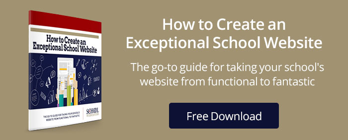
Download Our FREE eBook: How to Create an Exceptional School Website
Functionality
A functional school website provides easy-access to solutions and meets its audience’s needs. There are quite a few factors that go into website functionality. Try to keep all of them in mind as you consider your own school site:
- Clean, uncluttered design with a visually appealing balance of images, text, and white space. White space is a key here. Be generous with that. (Hint: whitespace does not mean actual space that is white, it means there is space for the eye to rest and an absence of text or images. It may very well be a color, but it will provide space between blocks of text and images.)
- Convenient, time-saving features. This includes online forms, accurate calendars, areas for targeted audiences (like prospective parents and students). Think of it this way; is there anything a parent or student should be able to get on your website that will save them the inconvenience of coming to or calling your office? What about enrollment forms? Staff applications? Schedules?
- Uncrowded home page. Don’t try to cram everything onto this one page. Instead, create logical categories where site users can easily identify where to look for the additional information or resources they need. (See our detailed recommendation under Usability, below).
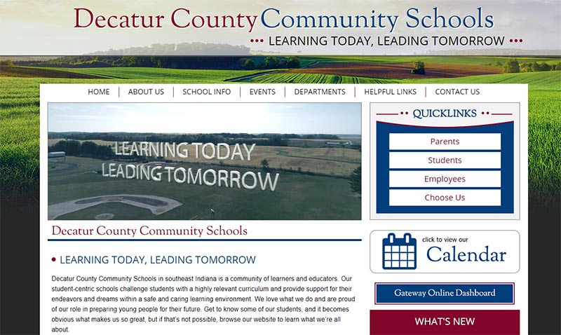
Want to see a few nice examples of intuitive functionality? Try these school websites:
Usability
All website developers will debate the most intuitive navigation and favored approach to provide the highest usability satisfaction. And, to make it more challenging, each industry is a bit different, with different user needs. We’re no different, and we have what we consider a proven and logical structure we recommend for schools. (Sometimes our school clients listen to our advice and sometimes they don’t. But, of course, the client is the boss.)
One way to test your site’s navigational effectiveness is to do your own usability study. Remember, the goal is to get users to the information they need as quickly as possible. A simple test is to ask a variety of users (not those already familiar with your school website) to see how easy it is for them to accomplish a given set of tasks. For example, have them register a kindergarten student, find certain events on the school calendar, locate the school lunch menu, or any other frequent need your site visitors might have. Have them rate the experience on, 1) how quickly they could accomplish the task, 2) how easy it would be to duplicate this task later, and 3) their level of satisfaction with the experience. This will let you adjust any areas that might need to be improved.
Navigation is key to usability
Keep it as simple and concise as possible. Be consistent in your navigation layout from page to page, or you’ll lose your site visitors. Stick with the traditionally intuitive over the creative for school websites. They are there to find information quickly, not to be impressed by an edgy, cool style.
So, what should be on a school website? Effective, logical main-level navigation might be Home, About Us, School Info, Events, Departments, Helpful Links, and Contact Us. Then add a few audience-targeted buttons like parents, students, and staff. However, we discourage using only audience-specific navigation as the main navigation bar. A few schools have started doing this because it is has a clean look. But, if not careful, the user experience can turn into a nightmare when users are forced to choose between parent and staff categories as their only choices—especially on large, district websites.
If I’m looking for the lunch menu or meal pricing payment and I can only choose between parent, student, or staff, I’ll then arrive at another navigation level for another set of choices. I’ll find it, eventually, but it will take me a few extra clicks and more time than clicking on departments and then the food service page. It can work, but weigh the pros and cons to see what works best for your school. If you are forced to choose between aesthetics and usability, we recommend favoring usability.
Easy to find
Are news, events, menus, staff contacts, e-mail addresses, and other frequently accessed website information current and easy to find and use? If you are not sure what the most frequently sought-after information is, check your website analytics or ask your office staff what the most common phone call requests are. You’ll have your answer in short order. Your office staff and your site users will appreciate NOT getting or making those repetitive phone calls that could easily be answered via the website 24/7 and at the site users’ convenience.
Common questions
Consider creating a Frequently Asked Questions (FAQ) page covering student policies for quick answers to questions like “What if my child is tardy?” or “What if my child is absent?” or “What are the school’s discipline policies?” Done right, these “Thou Shalt Nots” can be handled in a friendly, positive manner in this easy to use format. Tone and word choice can turn a contentious experience into an amicable one.
Cross-browser usability
This means your website should function properly in all of the main browsers. That doesn’t mean it needs to be supported by all older browsers, of course, at least not the ones no longer supported by their developers. But, don’t think that sticking a notice on your website that tells them to use just Edge or just Chrome will be enough. Test your website and your mobile views to assure that usability is consistent.
Fix errors
Check regularly and fix any broken links, outdated content, errors, and blank pages. Don’t use “under construction” notices either. If the page isn’t complete, then remove it from the navigation until it is. That’s like inviting someone to your house for dinner when your house is at the framing stage.
Accessibility
The idea of website accessibility is to make sure anyone on your site, from any device, can gain access to the information for which they are searching. This requires several areas of focus. Let’s review a few of the areas below:
Mobile-friendly
Recent studies show 95% of Americans own a cell phone and 77% own a smartphone. (Pew Research, 2018) This means that having a responsive, mobile-friendly website is becoming more important than ever. If you aren’t sure how mobile-friendly your school website is, Google has a helpful responsiveness testing tool. The logical solution is to have a responsive, mobile-friendly website. Just this one step will solve or mitigate several other accessibility issues as well.
Fast loading
Not everyone has high-speed broadband, and especially if they are using a mobile device, consider your load times. This is particularly true of your home page, so you might not want to put resource-hogging elements on the home page. There are lots of possible solutions to faster loading websites—everything from page caching to image compression to implementing a content delivery network (CDN) and optimizing JS and CSS files. Whatever it takes, make this an ongoing project. All of your site users will appreciate it.
ADA website compliance
Studies indicate 19% of the population has some form of disability. That is about 56 million reasons to make sure you correct any website accessibility issues your school website might have. Not only will you reduce your risk of expensive legal action and comply with both federal and state laws, but you gain benefits in the form of usability, search engine optimization, reducing server load, and enabling your site content on a different configuration, and you’ll be prepared for future and advanced web technologies. For more details about making sure you get and keep an ADA compliant website, check out these articles: How to have an ADA compliant school website, What every school administrator should know about website accessibility, or ADA website compliance, Part I & Part II.
So, these important first steps are enough to take your site to the level of the best school websites. We’ll cover the next steps in Part 2, where we will show you how to use your school websites to inform current parents and students as well as attract prospective students and quality staff. Join us there, and we’ll discuss how the best school websites must also be about engageability!
WHAT MAKES THE BEST SCHOOL WEBSITES? – PART 2
Bonnie Leedy, CEO, School Webmasters, LLC.