")


Ah, technology. Do you have a love/hate relationship with it? It seems as soon as you update your cell phone, TV, or even microwave, there’s a newer, better model right around the corner. Having the latest technology with all the bells and whistles has become not only a cultural status symbol, but it’s become absolutely essential to many consumers. It’s no wonder cell phone providers have developed creative incentives to encourage you to update your phone as often as once a year!
Websites also have become essential for all organizations—from Fortune 500 companies to non-profit organizations, and, yes, even for your school.
You certainly don’t need to overhaul your school’s website every year, but you do need to make sure you’re presenting your school in the best light by keeping up with current website trends. Your school website is the key component to all of your digital marketing efforts and often the first impression prospective parents have of your school and your values. So how do you know when it’s time for an update?
It’s time to update your website…

#1. If you don’t have a mobile-friendly (responsive) website design
If your website is not responsive (meaning it looks weird on a mobile device), you are definitely long-overdue for a redesign. The percentage of folks who use their phone and other devices most of the time increases daily. So, it is critical that the website is designed with well-thought-out space and navigation. Your website should be designed with “mobile-first” in mind.
Your site visitors will access information on their phones differently than on their desktop, and your website must address that reality. For example, if there is a lot of information on the home page, they would much rather see a social icon or link to the social media feeds than have to scroll through and past all the embedded social feeds in order to find the phone number in the footer.
Download Our FREE eBook: How to Create an Exceptional School Website
In addition to your viewers’ expectations, for several years now, Google has been penalizing websites (with lower rankings and less likelihood that you are found during searches) if your website is not responsive. You definitely want to come up in any search where parents are investigating schools in order to decide which might be the best choice for their child. Being found, and quickly, is essential for increasing your enrollment. It is also important for the convenience of your existing parents and families.
Websites that are 3–5 years old are also likely to have dated coding in the background, which can produce multiple issues, including security risks, accessibility issues, slow loading, and many others.
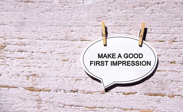
#2. Your website’s home page does not make a positive first impression
- Busy busy: Make sure it’s not too busy with lots of various things going on (many buttons, many different kinds of graphics, slideshows, embedded videos, lots of gradients, etc). Clean and minimalist is king now.
- Too much is too much: Avoid using too many colors and more than two main fonts. Also remember that anything flashing tends to date your site quickly as does too much texture and too many buttons.
- Silly slider: A pointless slider in the header serves no purpose for your visitor. No one sits and watches these any longer. If you are going to insist on a slider, at least incorporate important calls of action within them. A huge image in the header with no call-to-action is a waste of space. If the first thing someone needs to do is scroll down to see any kind of information, that makes for a poor user experience. A large picture at the top of the Home page is still a trend, but use the space wisely while including something along with it.
- Logical layout: On Home pages, if a site only has two columns with a main body and sidebar, it looks dated and needs a refresh. There are so many more interesting ways to present information on Home pages these days. A main body and sidebar are fine on subpages since they are generally there to only present information. But a home page is for at-a-glance info to get you where you want to go.
- Quick links: The navigation and quick links should have strong categories but be kept simple and clean. Use them to ease navigation and create intuitive and easy-to-find information. Use them well and keep them simple
- Hover heaven: Button or navigation hovers and any movement on the page should be cohesive and used sparingly. One to three hover transitions throughout the site is sufficient. Any more than that is just too much.
- Wise width: If your entire site is still contained within 1200px, it may look dated. The content can still be contained within 1200px, but just stretching the backgrounds, navigation bars, and images the full width of the screen results in an updated design.
#3. If your website is slow loading
If your website is slow loading, commonly due to extremely graphic-heavy designs, using images instead of CSS for styling, or hosting or development inefficiencies, you put your school at a disadvantage.
Since your website is often a prospective parent’s first impression of your school, the judgment they form from this experience matters. It is estimated that if your site doesn’t load within three seconds, 40% of your site visitors will abandon your site. When this happens, you defeat the purpose of having a website. Website speed is imperative for a good user experience. Do a speed check to see how your website measures up. The faster your site visitors can get to the information they need, the more satisfied they will be.
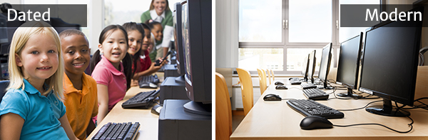
#4: If your site’s colors or photos are dated
Colors and photos make the difference between an attractive and updated website and one that is unappealing and fails to inspire confidence. Regarding photos, out-of-date photos generally look dark and drab, while modern ones look light and bright. The photos that look older may not really be old, but they give that appearance. For example:

Another tip: Make sure objects in the photos are still being used in today’s classrooms. For example, chalkboards are seldom used anymore; everyone has smartboards or at least whiteboards. And computer monitors are no longer huge and chunky but sleek and slim (or laptops).
Regarding your website colors—avoid those that clash. Use neutral colors that complement main colors. Use bold/strong colors as the main color instead of as accents here and there. Graphic designers say we should ask ourselves if the website feels “heavy.” It’s okay to use bold colors, but today’s sites should still feel clean and light.
Consider your page background colors as well. Avoid using too many colors as backgrounds behind text, and be sure to include enough white space. The white space areas will help keep your site feeling clean and light. It also improves contrast, which assures that your site will be accessible and ADA compliant (at least in the area of contrast).
#5. If your website is difficult to navigate
Your website navigation can make or break the user experience. Having a clear, easy-to-use navigation will provide good customer service, keep potential customers on your site longer, and help visitors quickly find what they seek. The following are some areas to consider when creating intuitive and simple navigation:
- KISS. Avoid trying to cram everything possible into your site’s primary navigation level. I realize your intention is to provide visitors with immediate access to all your page options, but fewer choices make it quicker to evaluate their choices and make a decision. So, be aggressive in editing your top-level navigation down to the fewest, most popular options possible and “keep it simple, silly.”
- Frantic flyouts. Your site users are accessing your website from a variety of devices. Touch screen devices technically have no “hover” state, so it is important that you make sure your navigation links are still accessible to users regardless of their device. Along these same lines, you’ll want to avoid fly-out menus with three or more levels. It is more challenging to navigate menu systems that have fly-outs within fly-outs. Avoiding unwieldy menus makes navigation easier on all devices.
- Be consistent. You sure don’t want to change your navigation menu once your site visitor figures out how to use it. Keep the same structure throughout the entire experience—from page to page and across devices. Your primary navigation should be set in stone to avoid confusion. Your users will appreciate your effort on their behalf.
#6. If your website is out of date
One of the most important aspects of a school website is that it is up to date. Your customers rely on your school website for useful information. Failing to provide them with current, timely information can destroy their trust. Being current and timely builds confidence. Your customers (your students and their parents) will know that your staff and administrators are highly engaged, and they’ll appreciate you for providing well-timed and accurate information.
I’m sure you’ve visited a website where the copyright is 2016 and the latest news article is from last school year, right? How did that make you feel? If their site—the public-facing image for their school—is outdated, you might question what the education and programs must be like. Don’t damage your credibility or put your professionalism in question by letting your site visitors read outdated information and think, “wait, that’s old news,” or “that’s not right.”

#7: Some pet peeves
We asked our designers what some of their pet peeves were. What screamed to them that a site is dated? Here are a few that didn’t quite fit into the above categories:
- Fonts. Avoid outdated or overused fonts. They specifically mentioned staying away from Comic Sans (which everyone should know to avoid by now), and now Papyrus is becoming a bit overdone.
- Coming soon. Just don’t! If the page or information isn’t ready yet, don’t put up a sign saying it isn’t ready yet, and don’t activate the page until it is. It’s just bad form.
- Flawed footers. Check your website footer. Is the information there still current, including the copyright date? These tend to become overlooked since they remain the same from page to page; when there is an error, it ends up on every page. So, check to be sure all the information there is correct.
- Dreaded white box. Incorrectly saved logos and buttons so that they are surrounded by a white box are a sure sign of amateurish layout. Save the graphic as a JPG on a colored background that matches the site or as a PNG with a transparent background.
It’s an ongoing process
Because your school website is often your chance to make a great first impression on prospective parents, how you manage it is critical. It is important to put your best foot forward. An outdated website doesn’t positively represent your school or the education you provide to your students.
Your website, its content, images, and layout should reflect the best you have to offer. Is it time for a tune-up? If so, please contact School Webmasters and let us help you make your school’s website the best example of all your school has to give. Request a quote today or give us a call at (888) 750-4556 and speak with Jim.
Posted by Bonnie Leedy, CEO, School Webmasters, LLC.