")


The images you share on your school website and your school social media make a huge difference. There’s an old Chinese adage that says, “When I hear, I forget. When I see, I remember.” Typically the saying refers to learning something—in this case, I want you to think about it in terms of your school marketing, public relations, and brand. Seeing is remembering. If you’re trying to make an impression on your community and prospective parents, you need to show them something about your school that’s worth remembering.
Pictures and images help your community see your mission and vision in action.We share the importance of good photos for your school website along with some photography tips in a past blog called “You Don’t Always Need a Thousand Words: Just a Few Good Photos.” It’s worth a read if you missed it!
So, because we covered all that previously, we want to focus on something else regarding your school photos.
The Americans with Disabilities Act (ADA) exists to help prevent discrimination against individuals with disabilities. When it comes to your school website, there are many regulations and guidelines in place that will help you provide an equal user experience to individuals with disabilities who use your website. Many of those accessibility guidelines relate to posting and sharing images.
If you’re worried about maintaining ADA compliance and avoiding a complaint filed with the Office of Civil Rights (OCR), then you might be anxious when it comes to sharing your school photos online.
Yes, there are things you need to take into consideration—but don’t let that stop you from reaping the benefits of showcasing your school online! In this blog, we’re going to share some of our best practices and tips for sharing photos in an accessible way.

Photo Accessibility Tips
When you consider sharing images online, there are clear do’s and don’ts. Here’s a simple breakdown:
Add Alternative Text
All images on your website need to have alternative text. For users who are visually impaired or choose to disable images, the alternative text (or alt text) is what displays and what a screen reader reads to describe the image. Here are two key tips to remember when adding alt text:
- Never start your alt text with a phrase like, “image of” or “a picture of”—the assistive technologies will identify your picture as an image.
- Then, just keep your descriptions short—don’t try to go into a lot of detail. If you’re not sure what to say, pretend you’re on the phone with a friend. What would you say in a sentence or two to describe the image? You might say, “There’s a picture of a teacher with her students working on a lab experiment.” For your alt text, leave out the part where you identify the image as “a picture,” and your alt text would simply read, “A teacher with her students working on a lab experiment.”
Mark Appropriate Images as Decorative
Some images on your website don’t require alternative text. According to the World Wide Web Consortium (W3C), decorative images can be marked as such when they are:
- Visual styling such as borders, spacers, and corners
- Supplementary to link text to improve its appearance or increase the clickable area
- Illustrative of adjacent text but not contributing information (“eye-candy”)
- Identified and described by surrounding text
To mark an image as decorative, you can leave the alternative text blank. Be sure you still include an alt attribute.
Avoid Using Images with Text
If you have created an image with text, you will need to make sure that all the text is available as alternative text. This becomes especially complicated if you’ve posted an event flyer as an image. Consider posting an accessible PDF instead of an image.
In addition to ensuring you implement alt text appropriately, text within images poses other accessibility issues. For example, when a user needs to increase the size of the text on a page by only zooming text, the size of the text within a graphic does not increase. We always recommend adding text as actual text on your web pages.
Check Color Contrast
The Website Content Accessibility Guidelines (WCAG) explain that contrast is a measure between the difference in perceived “brightness” between the foreground color and the background color. This is especially important to users who may have a visual disability such as color blindness. The best advice here is to avoid using text over an image, but if you must, then be sure to check the color contrast.
Include Controls for Image Carousels
First, we do not recommend image controls, as they are typically an accessibility nightmare. Images that scroll, rotate, or change automatically present a problem for some users. In order to be accessible, any script that causes images to automatically advance should include a function that allows the user to stop and play the movement. This function must be accessible to everyone—including keyboard-only users. In other words, you need to be able to stop and play the movement without using a mouse. Additionally, each time new content is loaded, the new content must be presented to everyone—including screen reader users.
Sharing Images Online—Best Practices
Now that you understand the basic guidelines for making your images accessible, let’s talk about where and how to share them.
Sharing Images on Social Media
When you first think of sharing images, you may think of social media. Instagram, especially, is prime real estate for your school images, and including images with your Facebook and Twitter posts increases engagement.
The downside of using social media platforms to share your images is that the platforms don’t necessarily have to abide by ADA regulations. The good news? There are ways to help make the information and posts you share more accessible.
One way is to add alt text as you post your images on social media. Most of the platforms have the option to add alt text under the “edit” function after you add an image. You should be aware that if you are using a third-party platform to schedule your social media posts, you might not be able to add the alt text. In most cases, you will need to add the alt text within the specific social media platform.
The second way—and best way—to make sure your school’s social media content is accessible is to make sure any image and information you share on social media is also available accessibly on your website.

Sharing Images on the Website
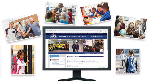
You’ll want to ensure your best school photos are also shared on your website, especially if you share a news article about an event, assembly, or classroom project.
Posting one image on your website is easy if you’re a School Webmasters client. Just send us the image and a brief description through our customer service portal. We’ll post it to your site following best practices to keep your website accessible.
If you’re using your own CMS, you’ll need to ensure you can add the alt text to the image as you post it.
Things get a little more complicated if you want to share a lot of images on your website. There are lots of ways and widgets to share slideshows and albums on your website—we’ve tested several of them! In this blog, we’re just going to share the best (and simplest) ways we’ve found to share lots of pictures and keep your website accessible at the same time.
Sharing an Album
So far, our favorite way to share lots of images accessibly is to create a folder on Google Drive and share it. A screen reader will read the file names, so you will need to rename the files with your descriptive text.
- Advantages: Google Drive provides easy viewing and sharing for your audience. You don’t need a Google login to view them.
- Disadvantages: Your school won’t have a lot of control over how the album is viewed. Your album may open up on a list view for some users and a grid view for others, depending on how they have set their Google Drive preferences.
Sharing a Slideshow
When creating and sharing slideshows, we prefer using Google Slides and publishing it to the web. You can find the “Publish to the Web” options under “File” in Google Slides. Keep in mind, in order to keep your slideshow accessible, you cannot enable features that auto advance the slides. You will need to allow the user to manually scroll through your images. The screen reader will read the alt text you provide with the image when you add it to your slide.
- Advantages: You have control over how the end user views your album. The slideshow is easy to share using the link or by embedding it. One big perk in creating a slideshow as opposed to sharing an album is that you don’t have to rename file names.
- Disadvantages: The slide show looks embedded instead of allowing a customized view to match your website.
Your School Website Needs Photos
Don’t let ADA compliance scare you away from sharing photos on your school website. Parents want to see the great things happening at your school, and we want you to be able to share them accessibly for everyone to see!
If you have any questions about ADA compliance or sharing images accessibly, feel free to reach out to our director of website accessibility, Marci Hess.